Live Events
Simplified Search
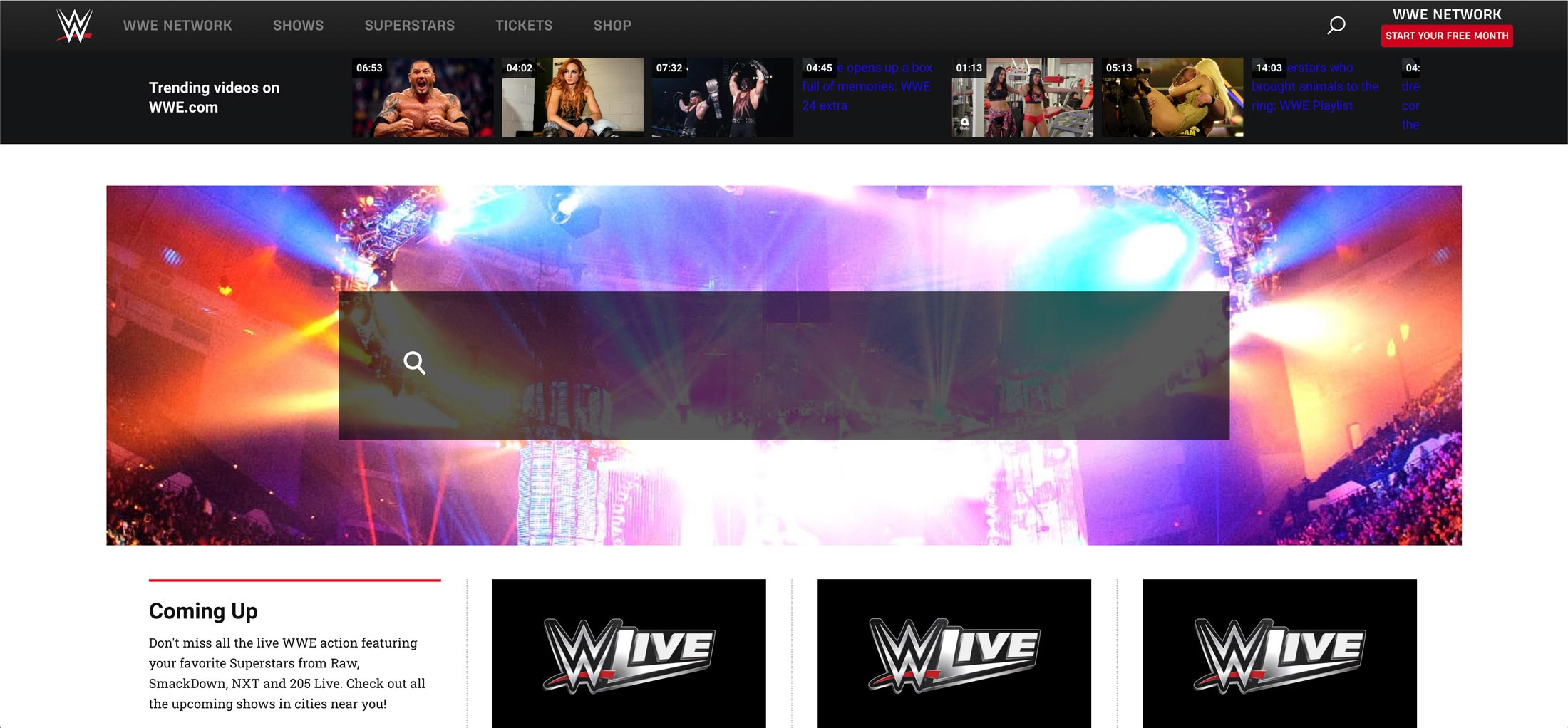
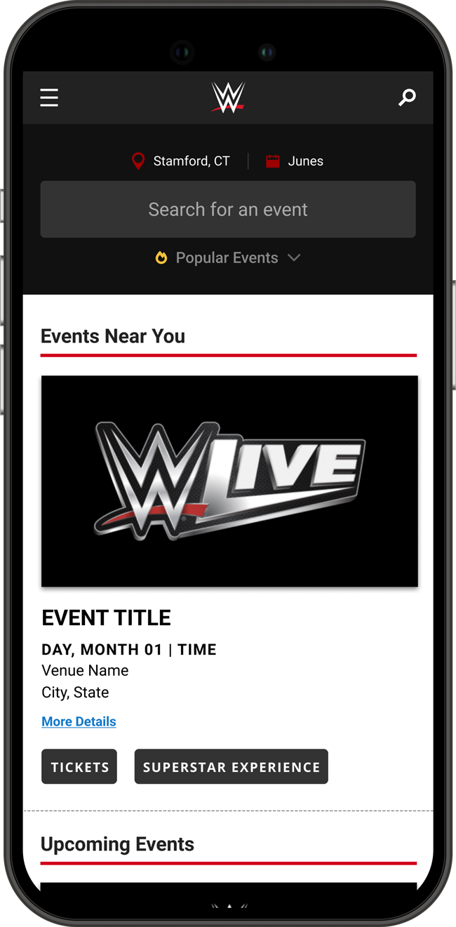
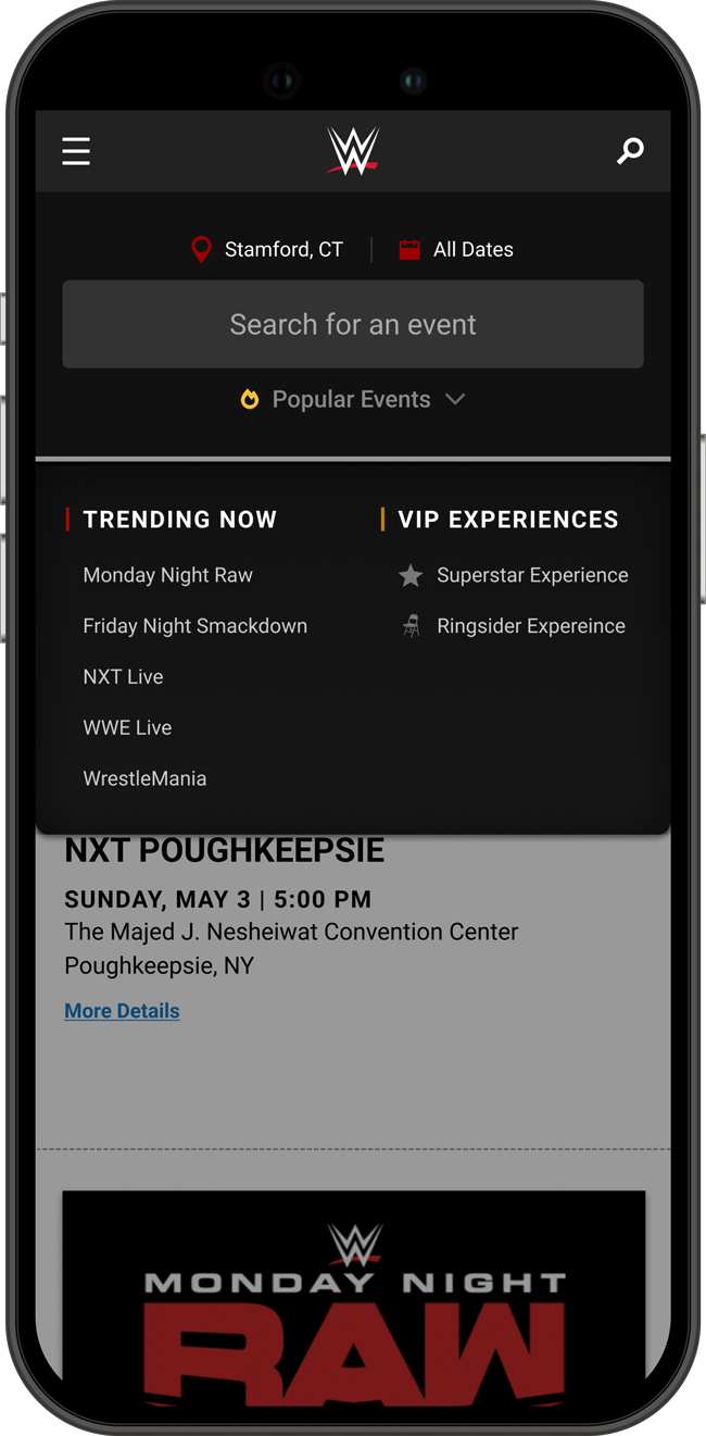
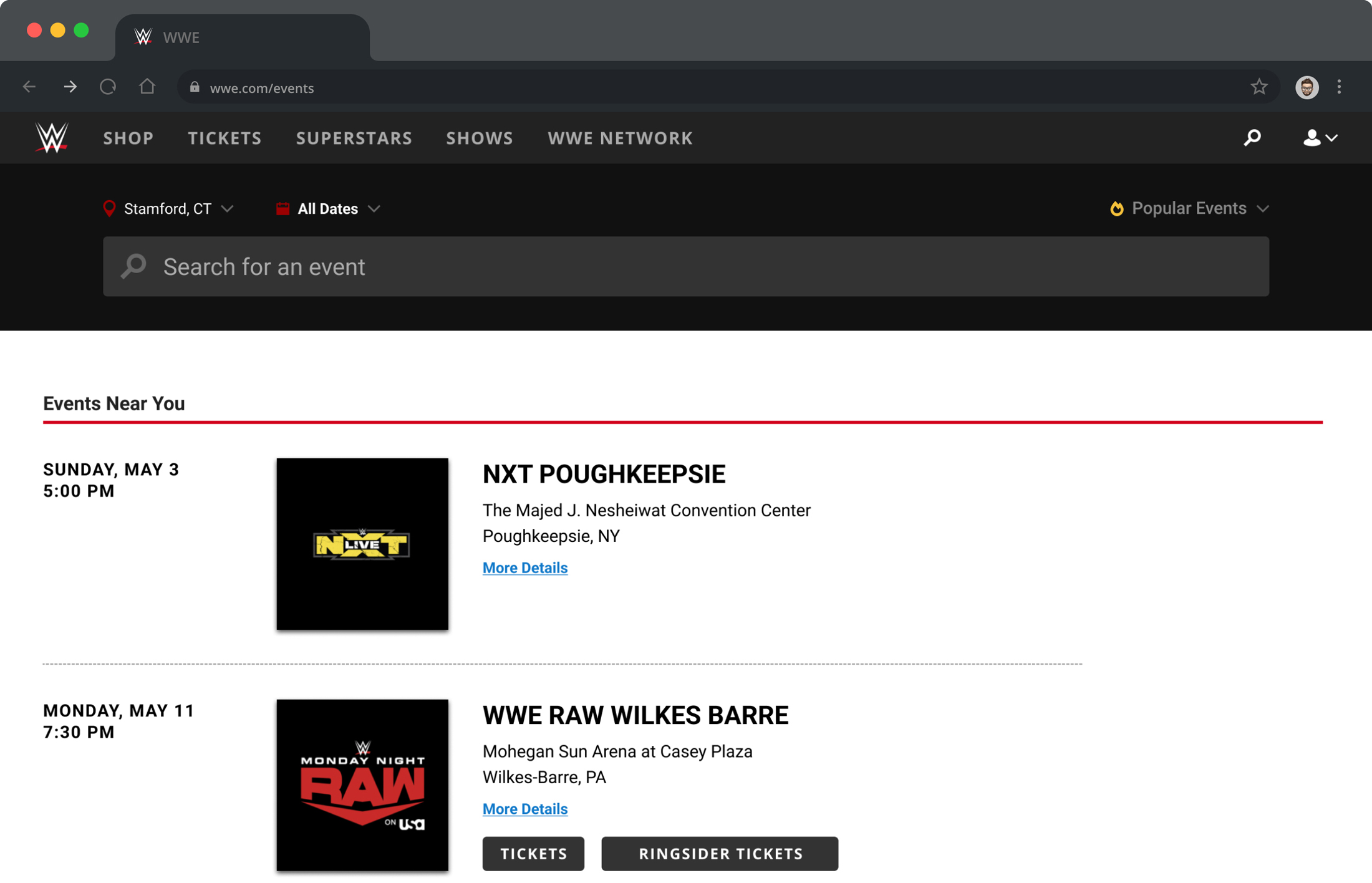
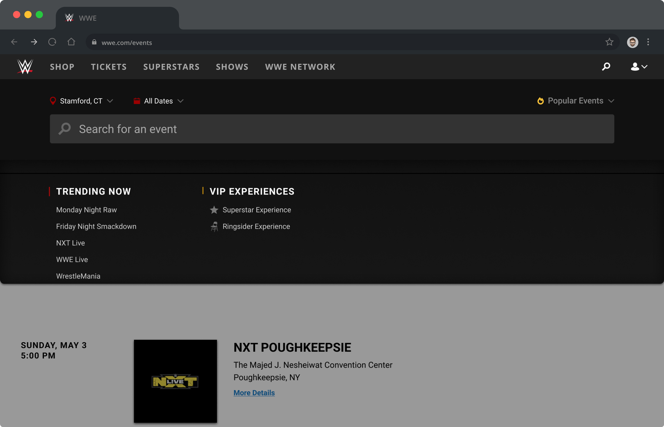
The redesign of the Live Events portion of WWE’s website was completed in multiple stages. The goal of the redesign was to streamline the process of searching for events to help drive ticket sales, starting with simplifying the search. Using Axure for initial wireframes, I came up with the concept you see below.
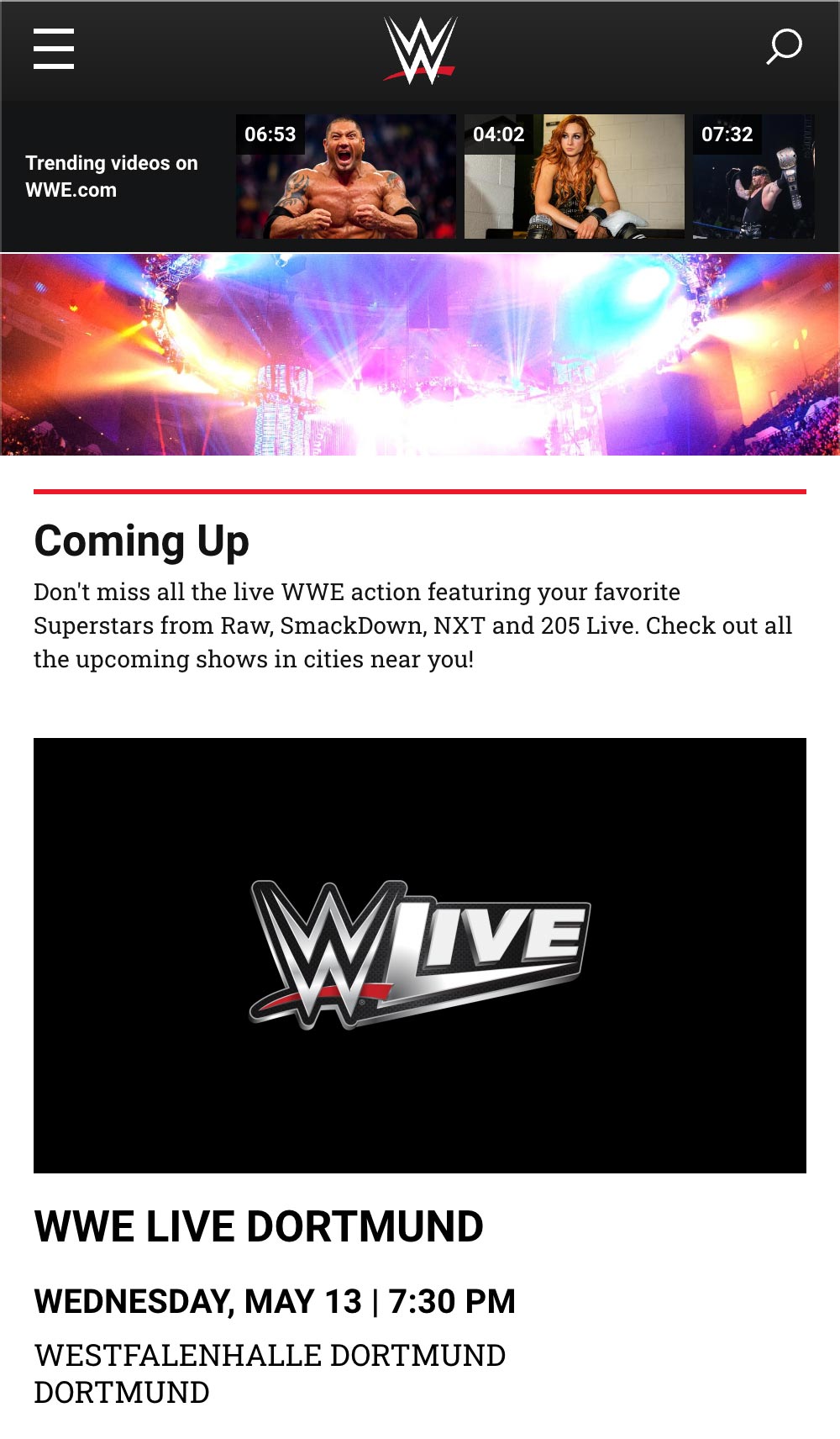
In the original designs you can see the search area takes up a large amount of room and does not offer options to refine your search.
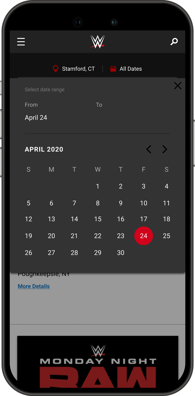
The updated design minimizes the amount of space taken up on the page, helping to display more information, while also allowing the user to further refine their search.
Events List
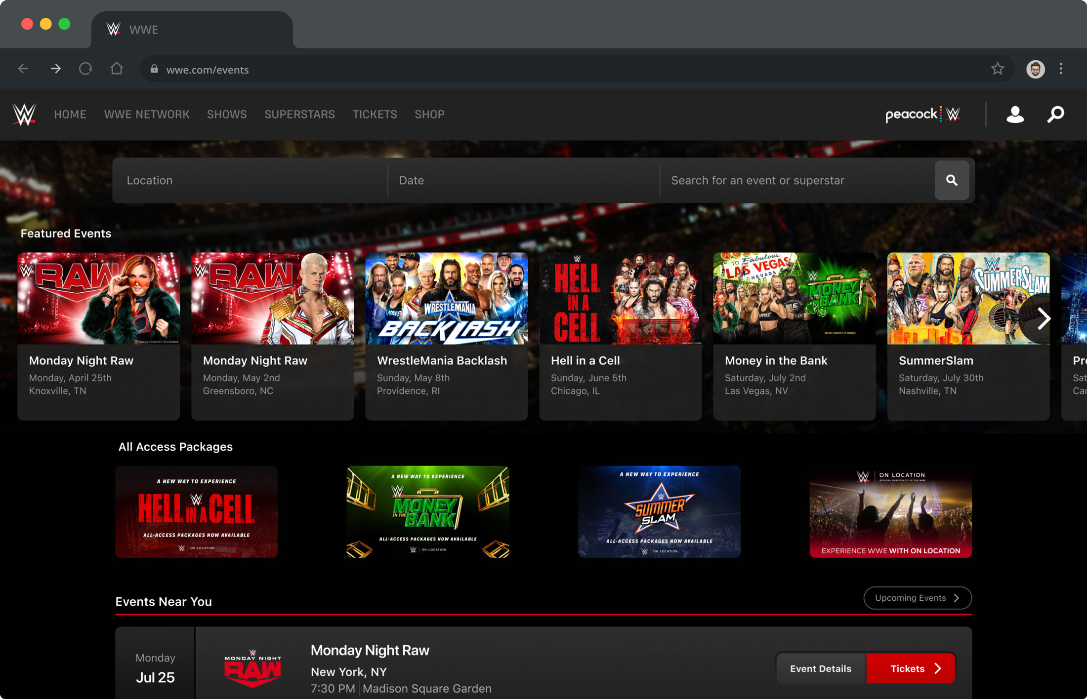
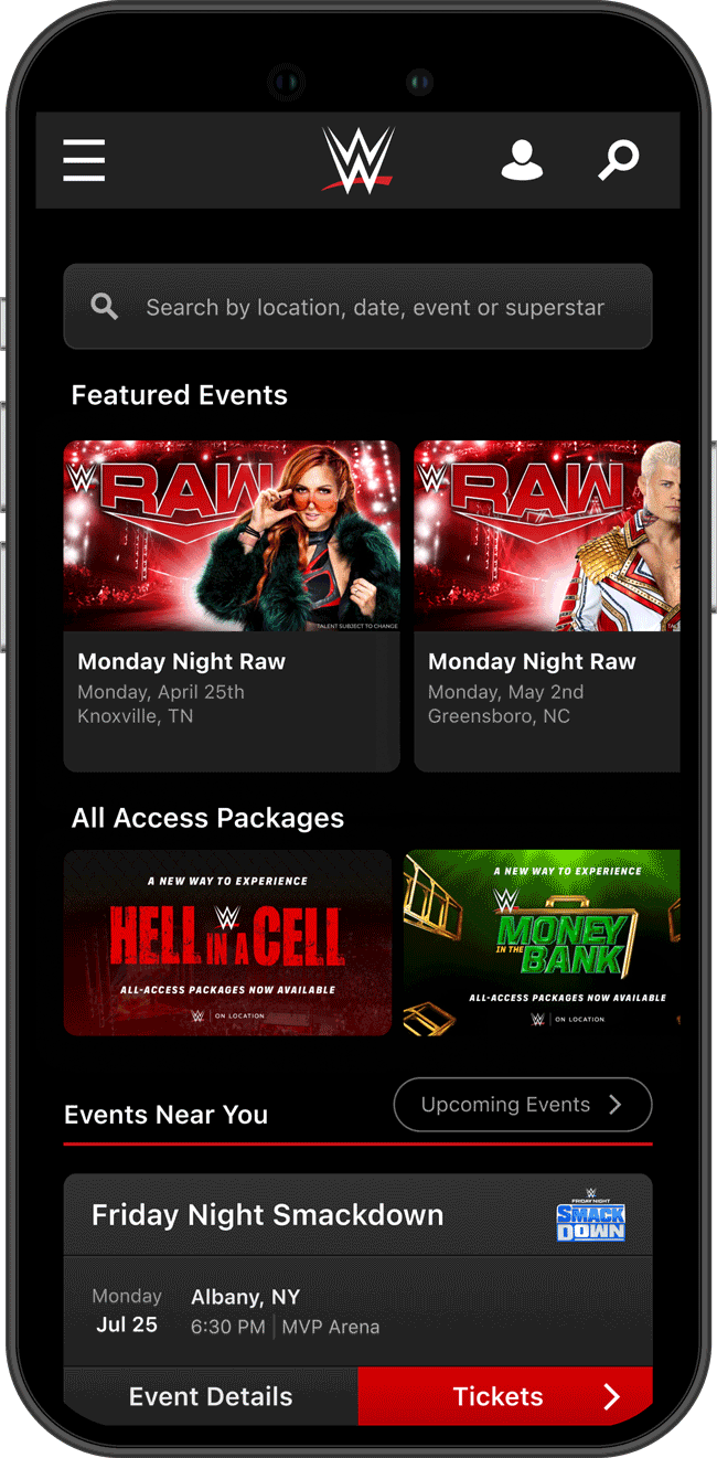
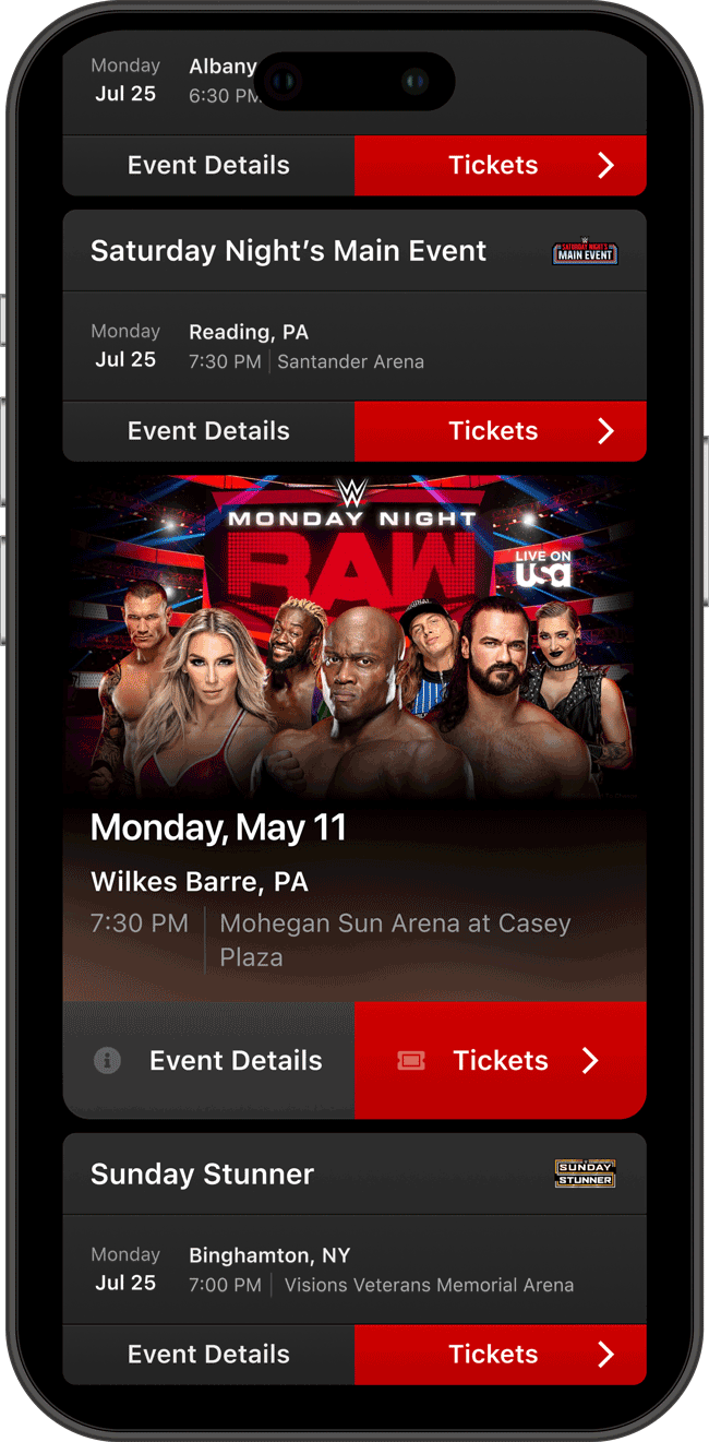
With the new search implemented, the Live Events section of the site was now ready for a complete overhaul. Our goal here was to save even more vertical real estate and allow for promoted events. To achieve this, I came up with the idea to put the list of events into cells that display all the information in more of a horizontal layout, display promoted events in a carousel in the header, and display VIP ticket packages in the header to help promote sales. I also updated the search bar so that it is more interactive and provides the same functionality as before. The dark theme follows the new branding being carried out through WWE’s products.
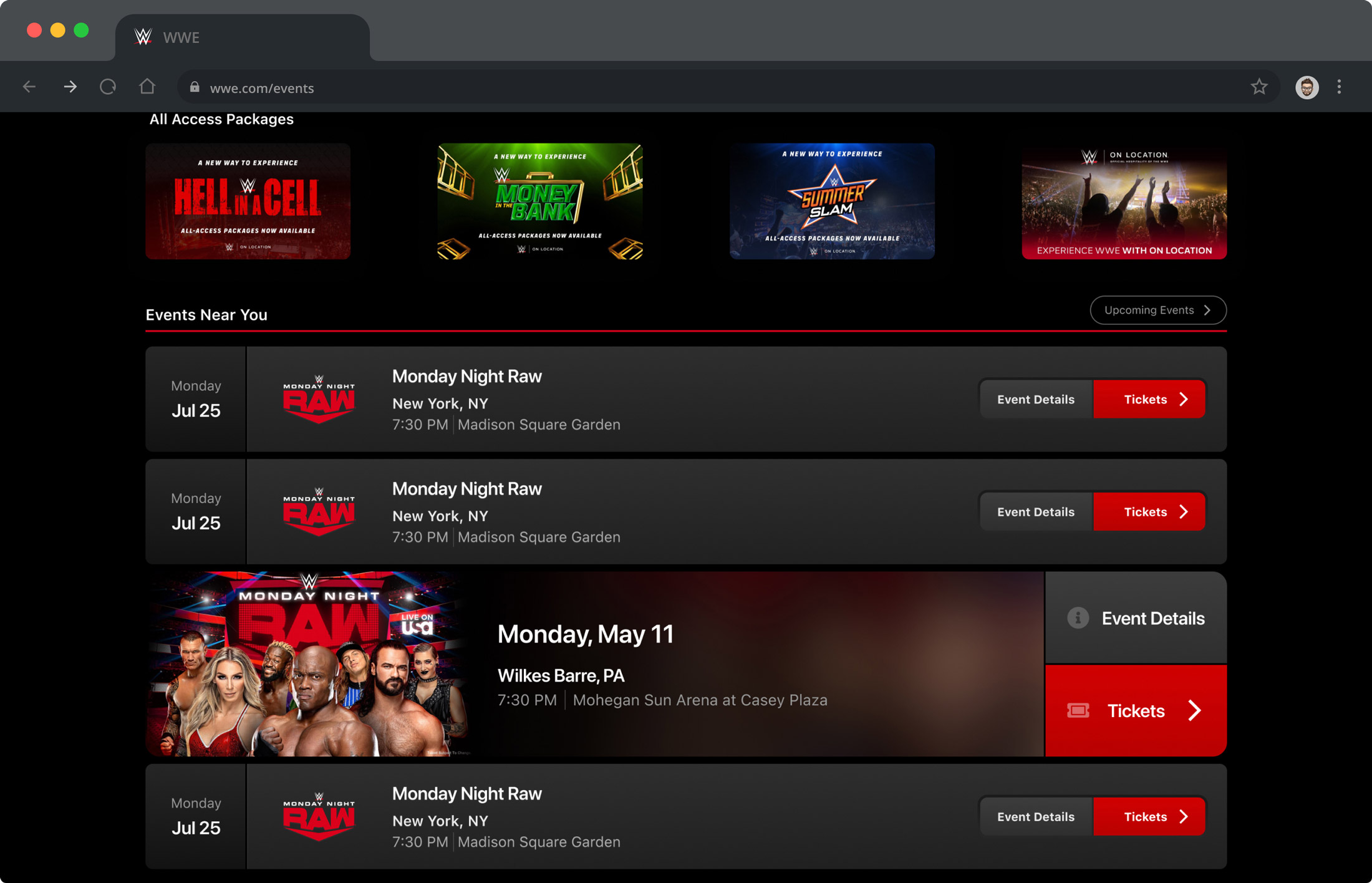 I also designed a cell used for promoting events that stands out from others within the list of events.
Event Details
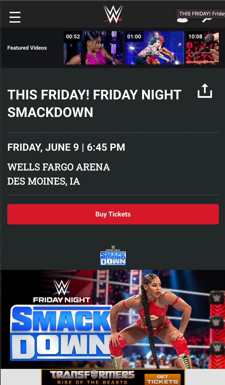
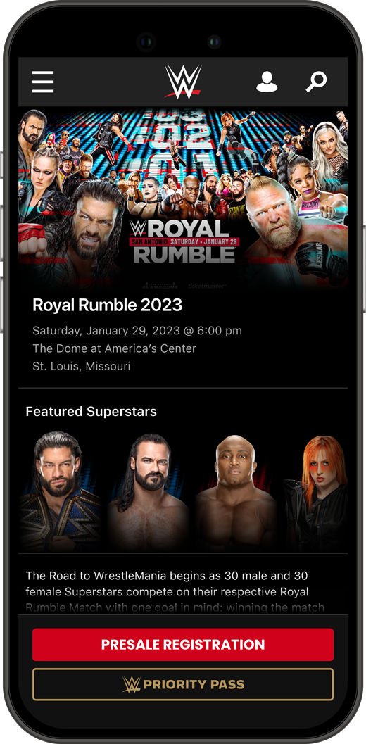
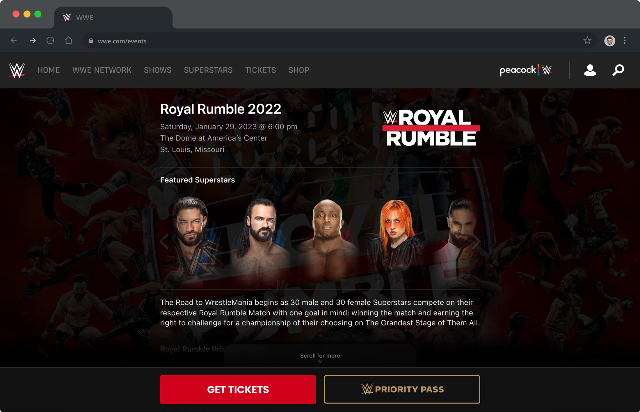
The last stage of improving the Live Events experience was redesigning the event details page. The More Details button within the event cell links to this page. Our goal here was to create a more streamlined experience while making it feel more on brand.
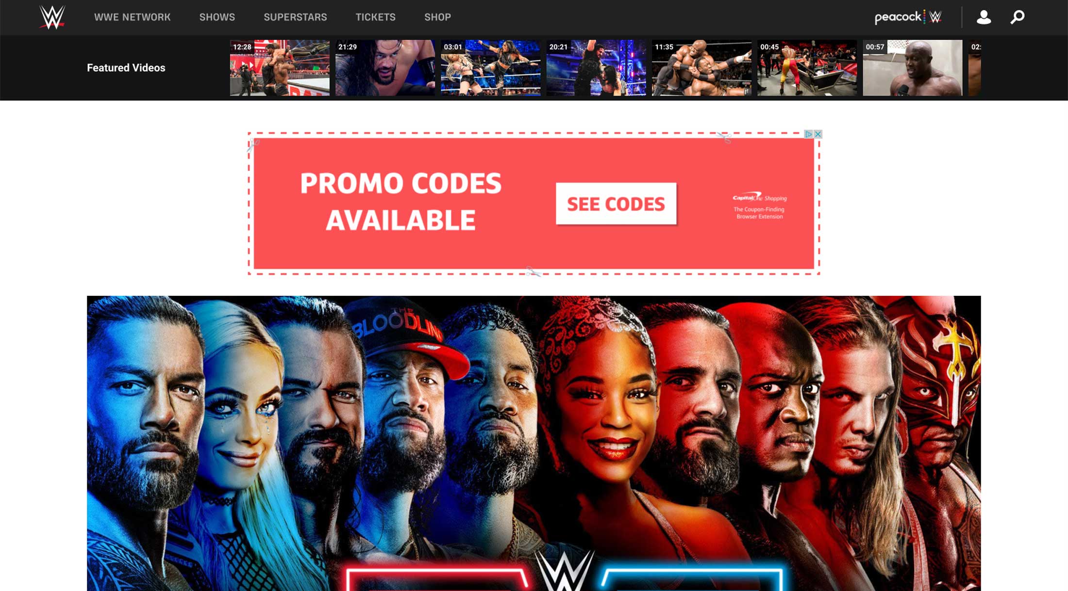
In the desktop version of the original designs of the event details page the user cannot see any details, not even the name of the event, until they scroll.


