Calendrier de Typographie
Texas State University
Class: Typography
Professor: Claudia Roeschmann
Year: 2015
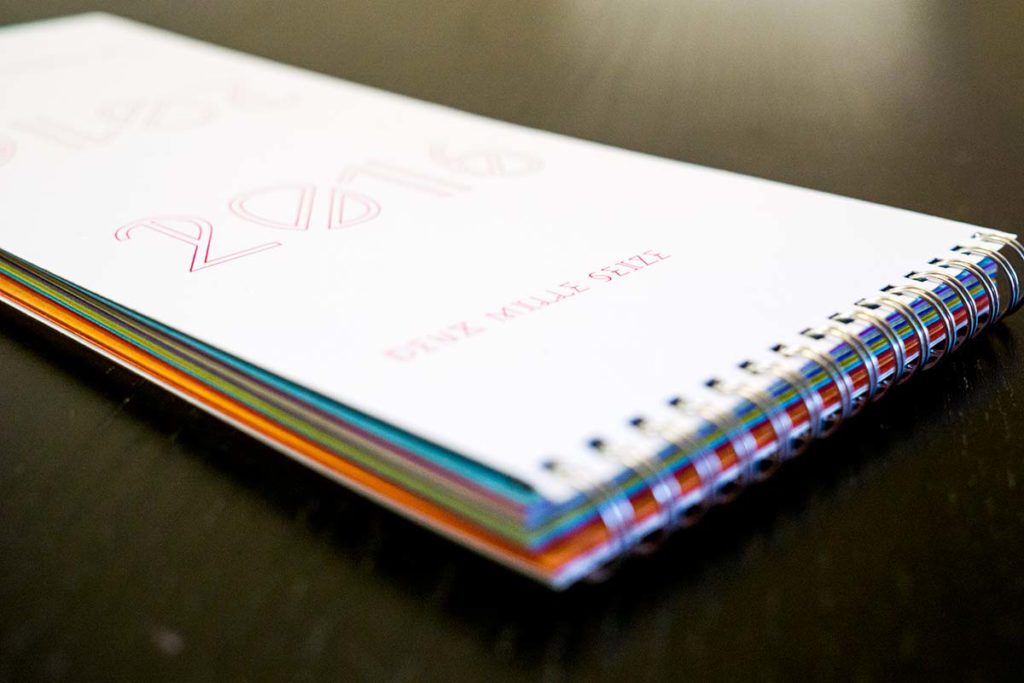
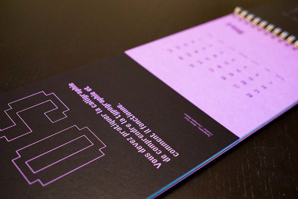
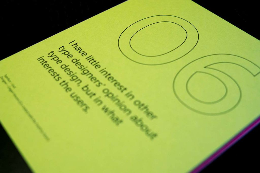
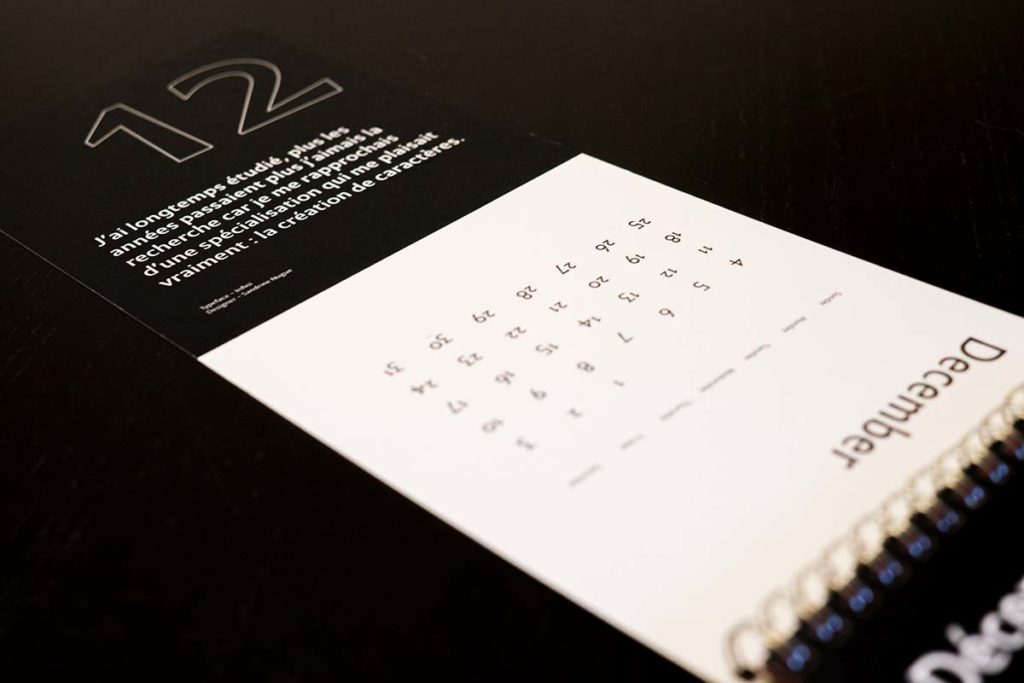
Calendrier de Typographie is a calendar in both French and English, which showcases a different French typeface designer for each month of the year 2016. The idea is that this calendar can easily continue for years to come by following the same direction of introducing a new typeface designer as well as a quote about typography from that person. The motivation for this project is to shine some light on the lesser-known French type designers.
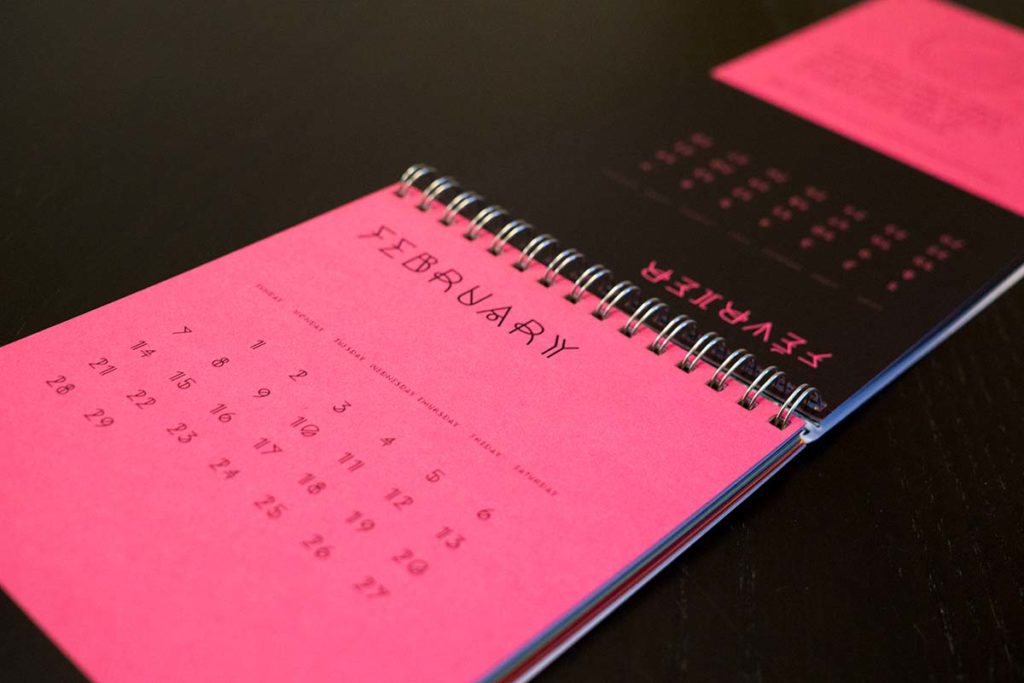
The calendar is printed on twelve different colors of heavyweight Pop-Tone paper made by French Paper, plus a plain white for the cover. The reason for choosing these colors is that they are similar to the colors of macaroons, a common French delicacy, which helps to enforce the idea that this calendar is related to France. The hole punched on both the top and the bottom of the calendar allows the user to decide whether they prefer using the French side or the English, or switch it up throughout the year easily by flipping it. The English side is black text on a colored paper background, while the French side is colored text dropped out of a black background. This makes it easier to differentiate the two calendars and helps to prevent the user from mixing up the two.

